Creating a peaceful and relaxing atmosphere at home often starts with the colors you choose for your walls and décor. Calm colors have the power to soothe your mind, reduce stress, and make your living space feel more inviting. But with so many shades and tones available, how can you select the best calm colors for your home? This guide offers helpful tips to make the process easier and enjoyable.
Why Choose Calm Colors for Your Home?
Colors influence our mood more than we might realize. Calm colors—typically soft, muted shades—can promote relaxation and balance, which is especially valuable in areas where you unwind, such as bedrooms, living rooms, or reading nooks.
Common calm color categories include:
– Neutrals: Whites, beiges, grays
– Soft blues and greens: Remind of nature and water
– Pastels: Light pinks, lavenders, and peaches
These colors tend to create a sense of space and light, helping rooms feel airy and tranquil.
Tips for Selecting Calm Colors
1. Consider the Room’s Purpose
Before picking a color, think about how you use the room. For example:
– Bedrooms: Soft blues or gentle greens help promote sleep and serenity.
– Living rooms: Warm neutrals or muted earth tones create a cozy, welcoming environment.
– Home offices: Light shades of blue or gray can aid focus without feeling too stark.
Matching the color with the room’s function helps you achieve the right mood.
2. Use Color Psychology as a Guide
Color psychology studies how colors affect our emotions. Here are a few calm colors and their effects:
– Blue: Often associated with calmness and stability.
– Green: Represents nature, balance, and renewal.
– Lavender: Combines the calm of blue and the energy of red, creating a peaceful yet uplifting feeling.
– Soft gray: Neutral and balanced, it provides a modern, understated backdrop.
While individual reactions can vary, these general associations are a good starting point.
3. Test Colors in Different Lighting
Natural and artificial light can influence how colors look on your walls. Paint small test patches in the room and observe them:
– During different times of the day (morning, afternoon, evening)
– Under varying light sources (natural light, incandescent bulbs, LEDs)
This practice helps avoid surprises and ensures your chosen color remains calm and comforting all day long.
4. Use a Balanced Color Palette
A room painted entirely in one calm color can sometimes feel flat or monotonous. To add interest while maintaining calmness:
– Pair your main color with complementary or analogous hues on smaller décor items, like cushions, rugs, or curtains.
– Incorporate textures and patterns to add depth without overwhelming the senses.
– Use white or off-white trim to define architectural features clearly and brighten the room.
5. Start with Neutral Bases
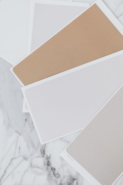
Neutral colors such as soft grays, taupes, and warm whites create a calming canvas that works well with a variety of accent colors. This flexibility lets you easily change your décor over time without repainting.
If you’re unsure about bold colors, starting with neutrals can be a safe and stylish choice.
6. Consider Personal Preferences and Trends
While calm colors have general benefits, personal taste matters most. Choose shades that you enjoy and feel comfortable with since you’ll be living with them.
Keep in mind that popular color trends shift regularly, but timeless calm colors like pale blues and soft greens rarely go out of style.
7. Use Color Samples and Inspiration Tools
Many paint brands provide sample pots that let you try out colors on your walls. You can also use online color visualizers and mood boards to see how colors work together.
Visiting local paint or home décor stores can provide inspiration and help you discover colors that you might not have considered.
Calm Colors for Different Styles
Modern Minimalist
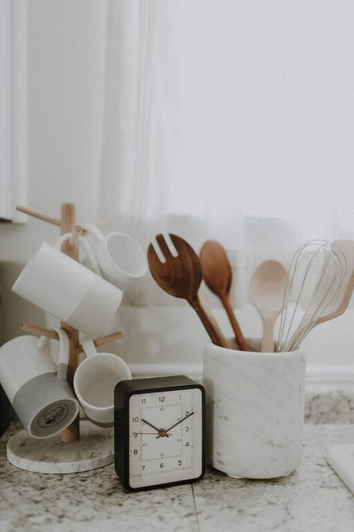
– Shades: Cool grays, white, and soft beige
– Accents: Matte black fixtures, natural wood
– Effects: Clean, uncluttered, serene
Coastal and Beach-Inspired
– Shades: Pale blue, sandy beige, seafoam green
– Accents: Whitewashed wood, light textiles
– Effects: Airy, refreshing, lighthearted
Rustic and Earthy
– Shades: Warm taupes, muted greens, soft browns
– Accents: Stone, leather, natural fibers
– Effects: Cozy, grounded, natural
Scandinavian
– Shades: Soft whites, light grays, pastel blues
– Accents: Light wood, minimal furnishings
– Effects: Bright, calming, functional
Final Thoughts
Choosing calm colors for your home is a rewarding process that can transform your space into a tranquil retreat. Keep in mind the room’s purpose, test your colors in different lights, and balance your palette with textures and accents. By focusing on comfort and your personal style, you can create a peaceful environment that feels just right for you and your family.
Remember, your home should be a sanctuary—let calm colors help you unwind and enjoy it every day.
About the Author